Take a look at this map created by Professor Mark Newman from the Department of Physics and Center for the Study of Complex Systems at the University of Michigan. But first, how cool would it be to get to say, "I work in the Center for the Study of Complex Systems." What a sweet gig.
So this complex thinker came up with this map of the 2012 presidential election results to more accurately reflect how undivided we are as a nation. As Professor Newman explains on this website, "One way to improve the map and reveal more nuance in the vote is to use not just two colors, red and blue, but to use red, blue, and shades of purple in between to indicate percentages of votes. Here is what the normal map looks like if you do this":

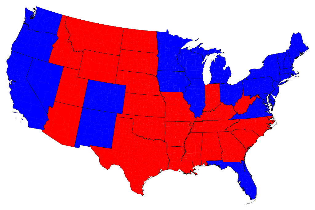
A regular map of the results of the 2012 election, the kind we're fed on TV and on most websites, looks more like this:
When you only consider the red-state/blue-state map, it appears that our great nation is much more deeply divided than we actually are. As a Kansas Progressive who often feels like a blue dot drowning in a sea of red, nuanced thinkers like Professor Newman give me hope that, if we pay attention and think critically, our nation will not resort to civil war again, no matter what sensational news report hints otherwise.
You can see Professor Newman's comments about how he created these maps and his FAQs here.
No comments:
Post a Comment